More Charts Showing a Crash is Highly Unlikely
Stronger Borrowers and Better Loans Make for Less Risk
I’ve been saying for a while now that the market would likely cool off and decline some but a 2008-like crash is highly unlikely.
So far I’ve been right, but that could always change...
..But it won’t. And Yahoo Finance just came out with an article that has some handy charts providing even more evidence for that thesis.
Another huge reason 2008 and today bear little in common is the structure of American mortgage debt. This article has some good charts on that.
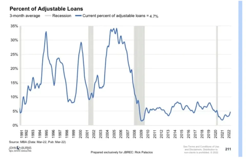
First, subprime mortgages fell from 34% of the total in 2006 to about 4% in 2022.
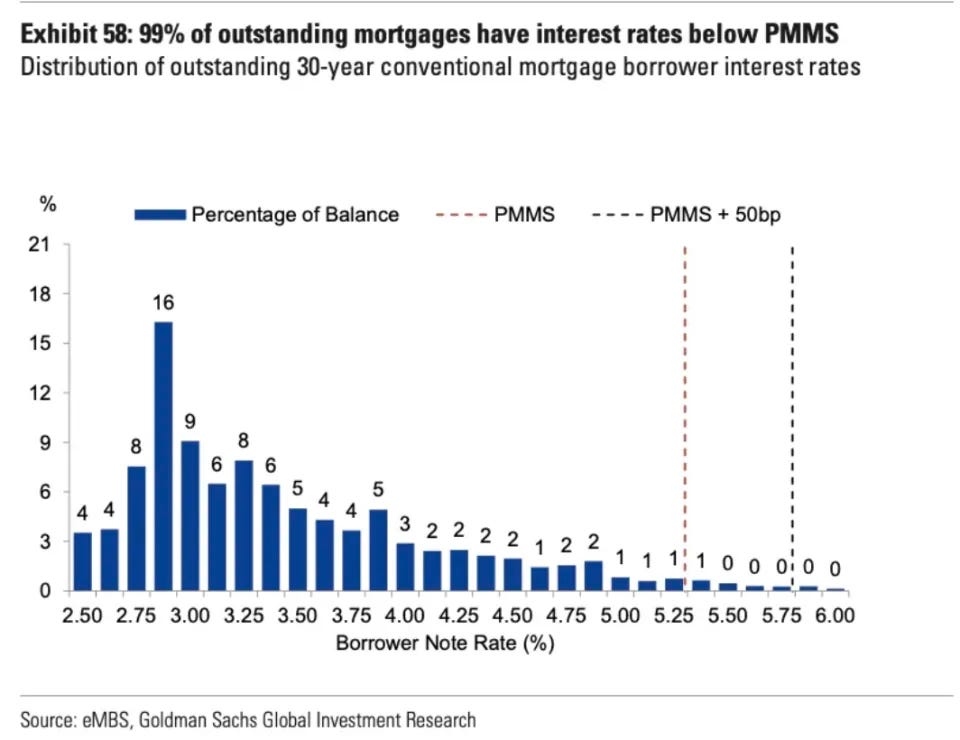
Second, 99% of mortgage holders have fixed rate loans that have an interest rate locked in for some time (often the duration of the loan) below the current market rate.
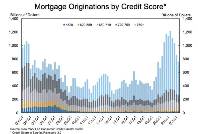
And then there's this chart. Needless to say, the creditworthiness of those who have gotten loans in the last few years blows those who were getting them in the aughts out of the water.
Indeed, those with a 760+ credit score more than doubled every other cohort whereas in 2004-2008, those with a 760+ credit score made up less than a quarter of all borrowers.
It’s important to remember what a crash entails. It is not prices declining. The Dow Jones, after all, is down almost 20 percent Year-to-Date but no one is calling that a crash.
A real estate crash would need be a severe price decline AND a financial crisis with a large increase in defaults and foreclosures that causes a vicious spiral and likely a waive of bank failures.
That, ladies and gentlemen, is almost certainly not in the cards.


